About
COVE Brand Guide
COVE Mission
Brand Personality
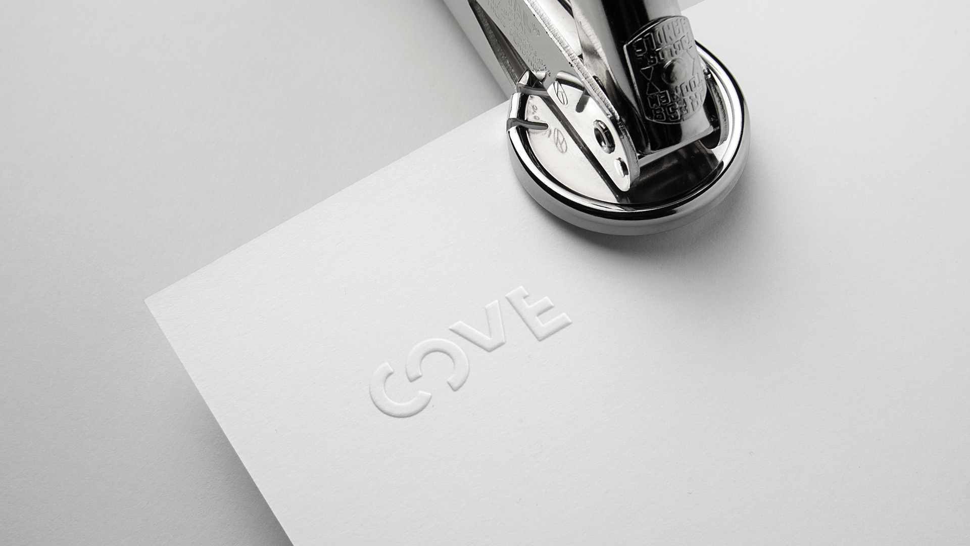
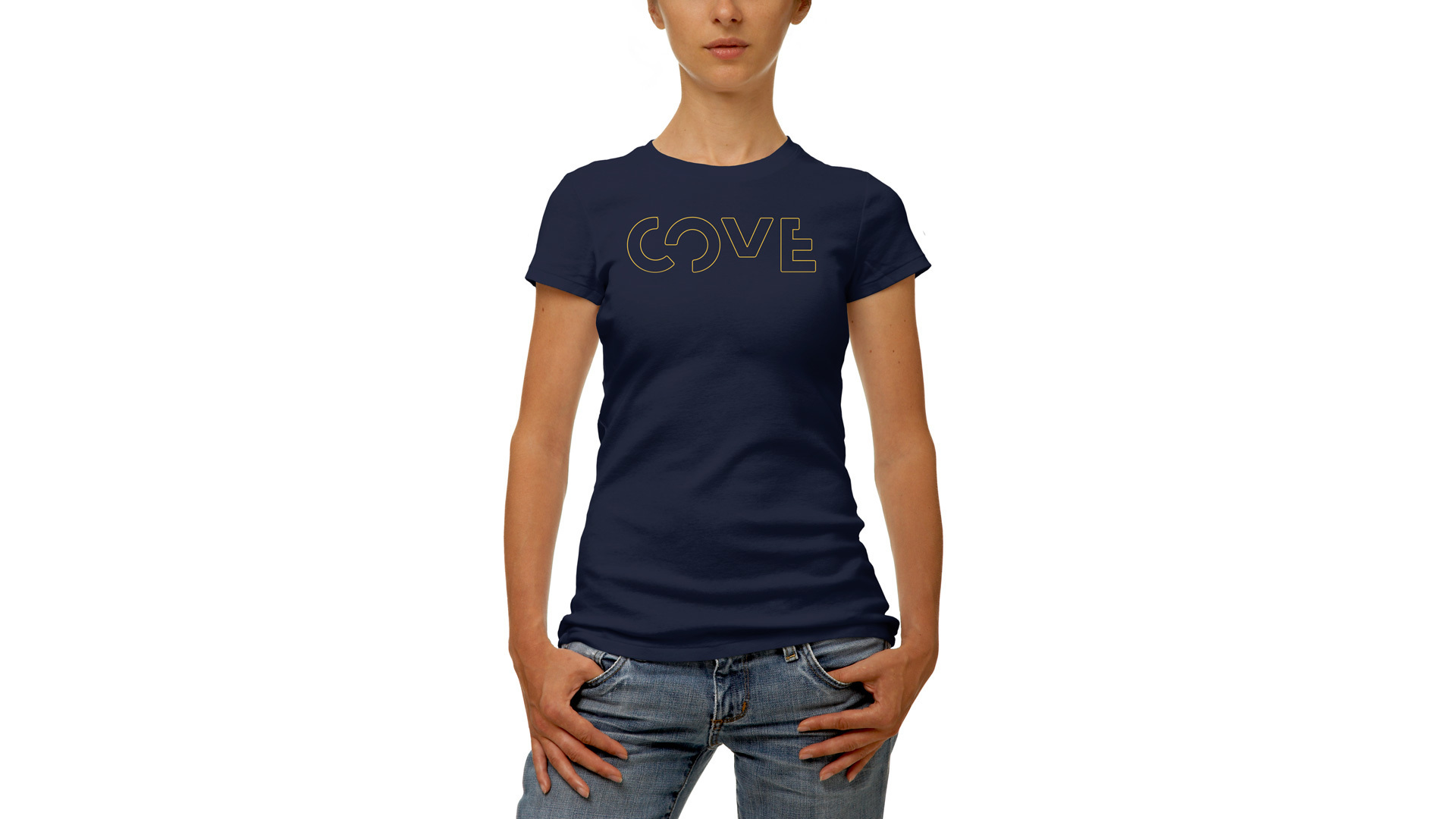
Logo
Versions
There are three versions of the COVE logo: the primary full color, reverse with the yellow tagline, and full reverse.
Clear Space
It is very important the logo has proper clear space surrounding it – it should not be too close to any other graphic elements or the edge of a page. Be sure to refer to the diagram below when placing the logo into artwork.

Minimum Size
Violations
The following images show examples of logo violations – be sure to refrain from using the logo any of these ways.


Animated
There are also options for utilizing an animated logo for video. Below is a preview of the animation options, as well as a button to download the .mpg files for the logo animations.
Color
Palette
COVE has a palette of three colors; blue, navy and yellow. Use the values below, as necessary when creating COVE materials.
Usage
The primary color of the COVE brand is the blue. The navy is a secondary color, and the yellow an accent which should be used much more sparingly. The example below gives a rough ratio percentage of how much each color that should be used on a single piece.

Accessibility
Accessible design allows users of all abilities to navigate, understand, and use your brand successfully. COVE strives to be accessible across all applications of its brand. With that in mind, the following examples walk through what color combinations are acceptable, and the best way to use them.


Typography
Typefaces
The typefaces for the COVE brand are Futura PT and Brandon Grotesque and should be used as outlined below.
Futura PT

Brandon Grotesque

Usage
There is a range of typography styles to choose from for COVE. Outlined below are some usage examples for print materials, but the styles and proportions can be translated or scaled to larger format or digital graphics as well.


Licensing
These COVE fonts are available for purchase and licensing below.
Alternately, if you are using Adobe Creative Cloud, both of these fonts are currently available for free use through Adobe Fonts – also linked below.
Futura PT Brandon Grotesque Adobe FontsAlternate Fonts
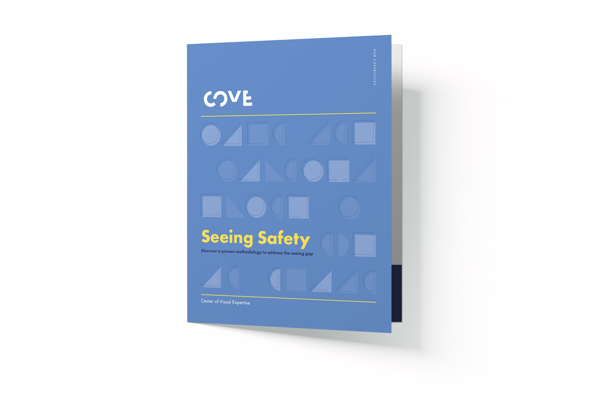
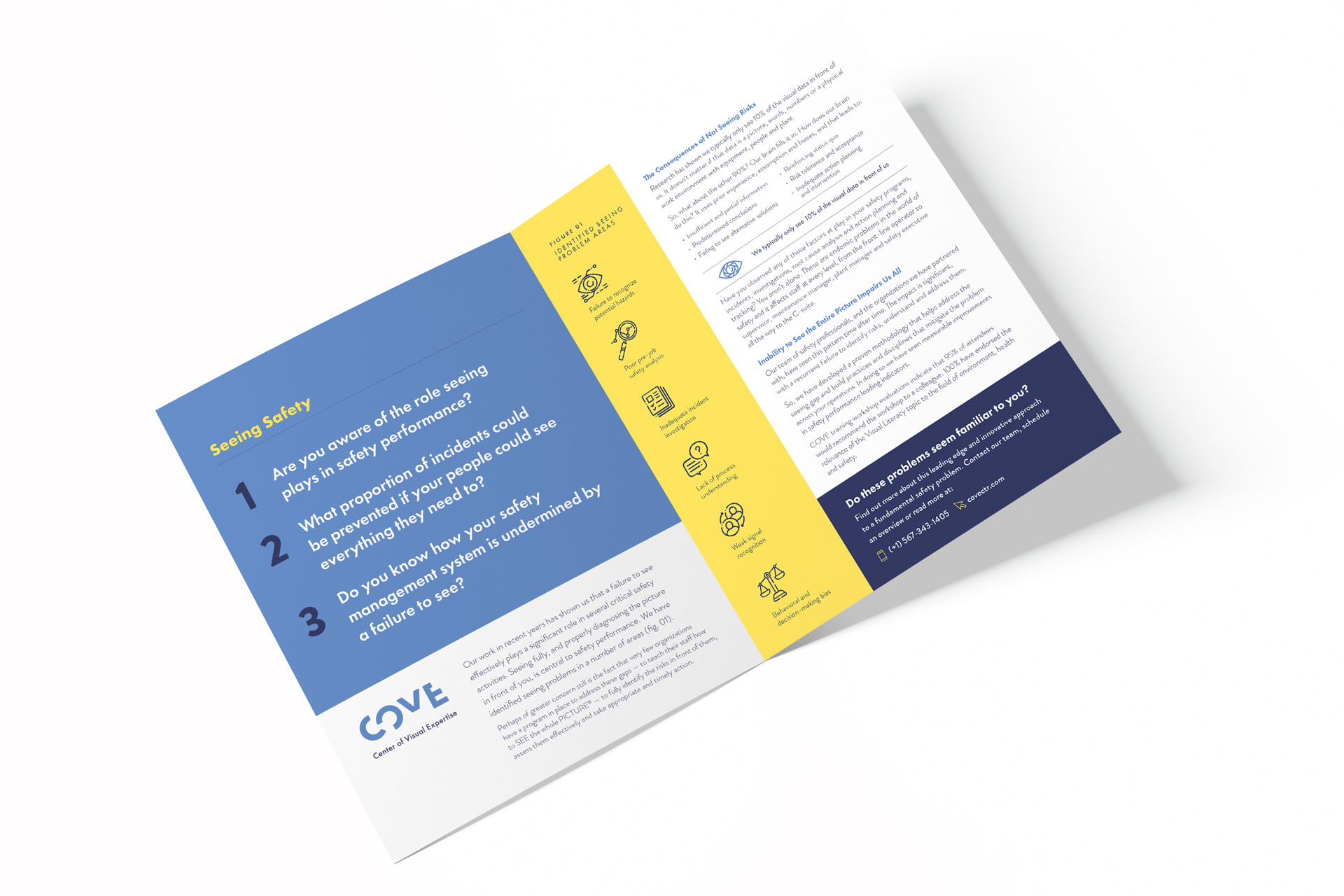
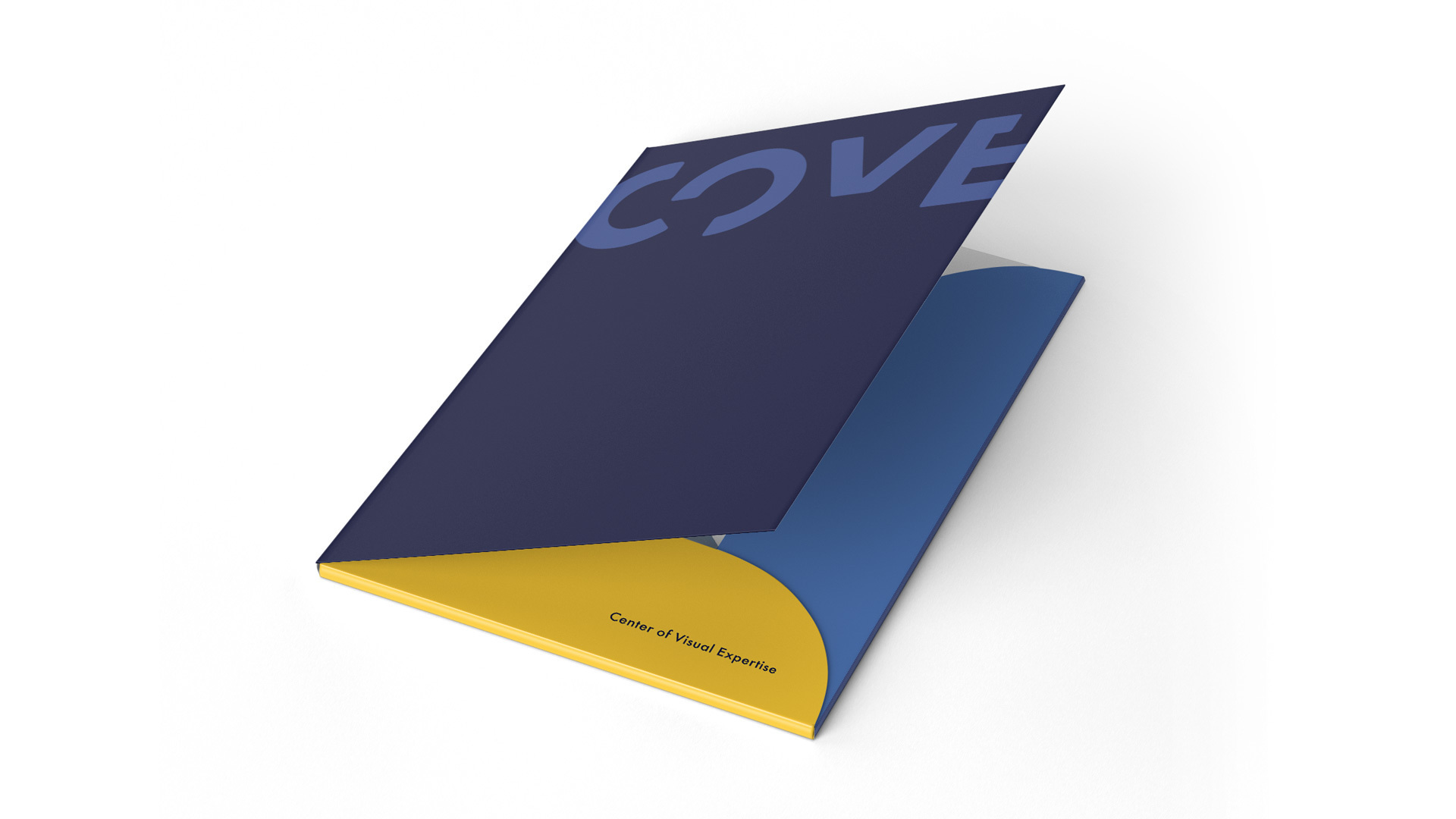
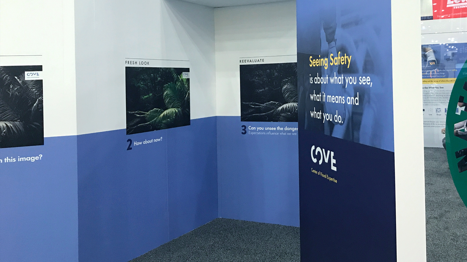
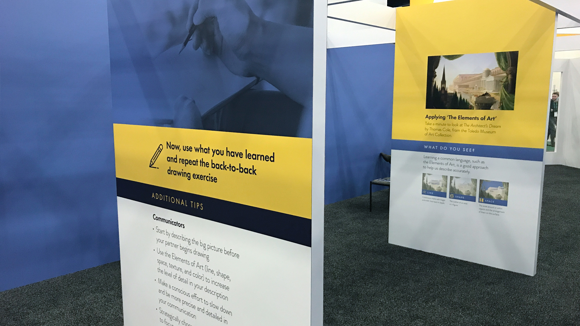
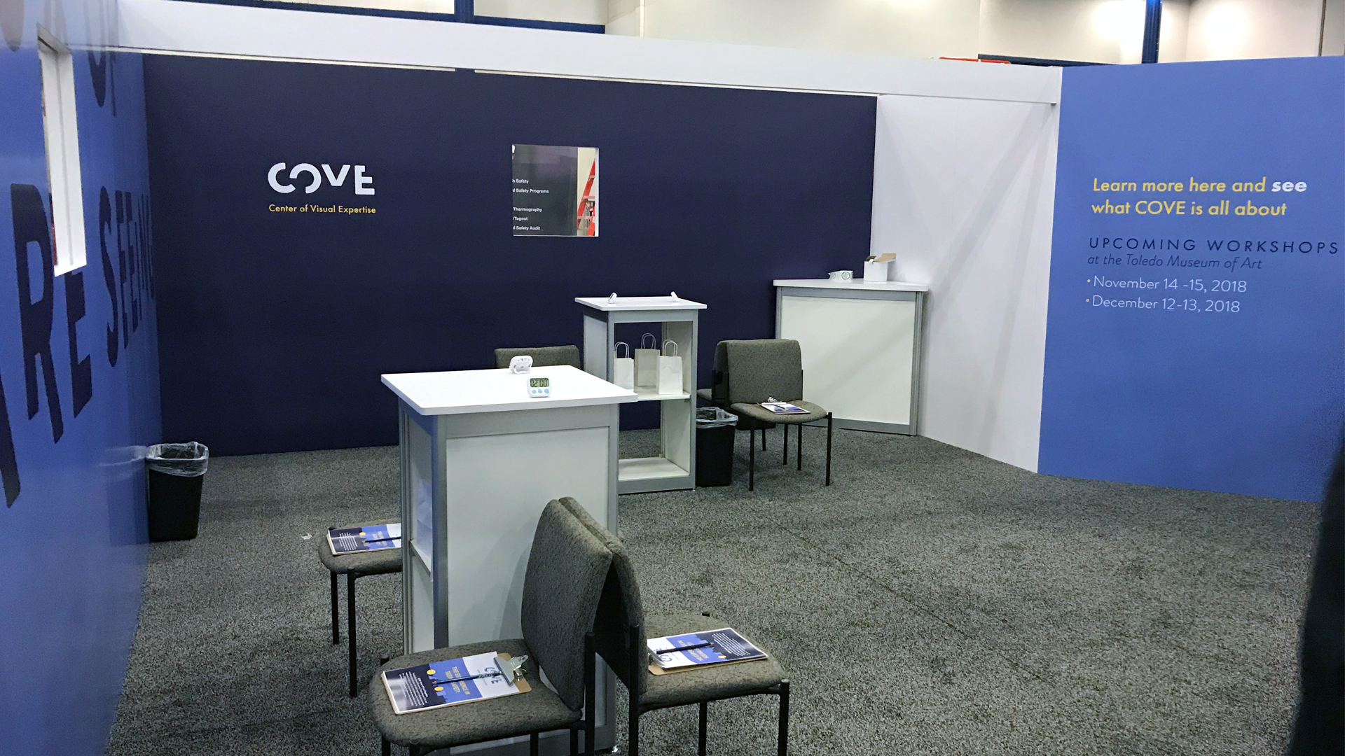
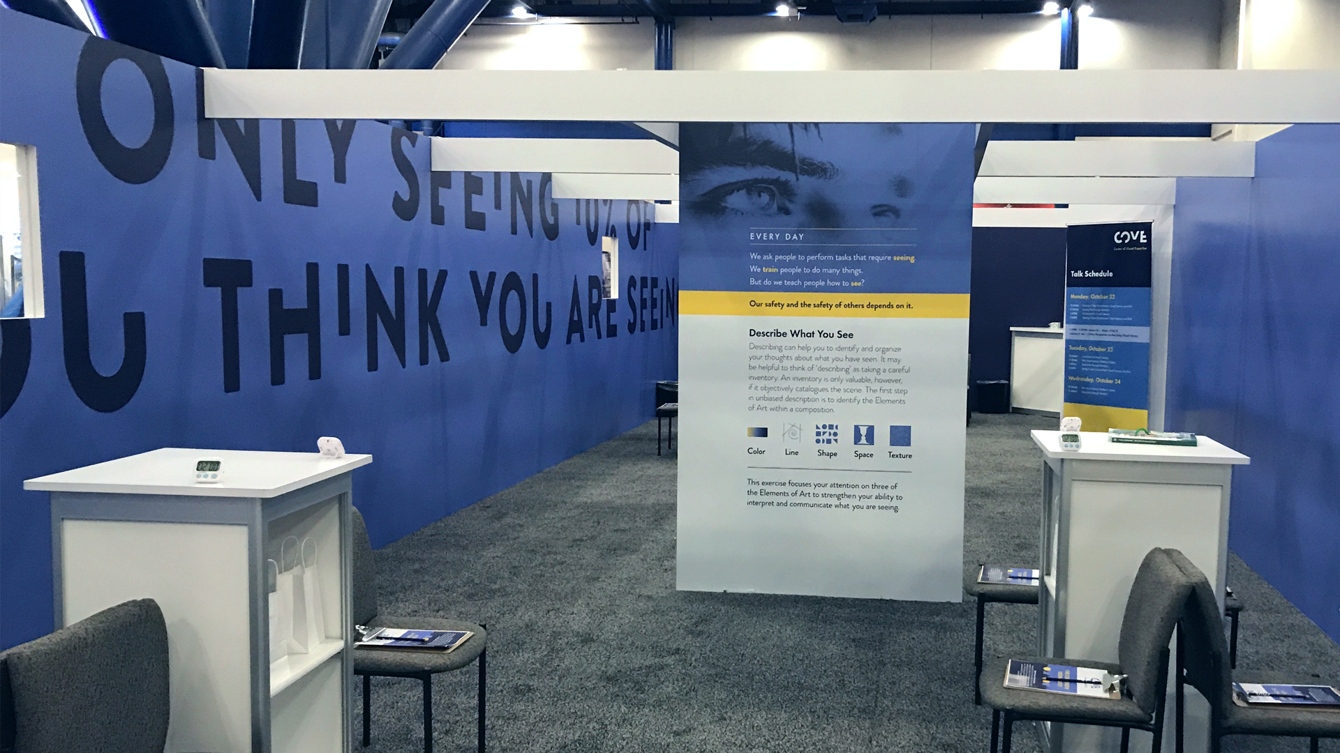
Applications